Understanding and Using the Most Common Types of Datasheet Diagrams
2024-08-21 | By Maker.io Staff

Before using a part in your projects, you usually refer to a part’s official documentation first. It’s typically best to read the manufacturer’s official datasheet, as those documents contain the most reliable and accurate information. However, diving head-first into technical documentation can seem daunting to beginners, especially when they reach sections that include graphs and diagrams. Still, it’s worth looking into those drawings in detail, as they summarize crucial data in the most compact form possible. This article discerns common diagram types, what they are suitable for, and how beginners can read them confidently and get the most out of technical documentation.
Understanding Common Types of Diagrams in Datasheets
While there can be many different drawings that concisely summarize information not easily conveyed by text or tables, most diagrams typically fall into one of the following categories.
 This image shows a typical block diagram.
Block and logic diagrams offer a high-level overview of a device’s internal structure and subcomponents. You can commonly find these in datasheets for integrated circuits, such as microcontrollers.
 This image depicts the 555 timer’s internal structure.
Schematic diagrams offer a more detailed view of a part’s internal structure. Manufacturers may also include simple schematics to show how a part can be used in example circuits.
 This image depicts a connection diagram for the popular 555 timer.
Connection diagrams are very similar. However, they focus on showing how a device’s external pins connect to its internal structure.
 This image shows a more complex timing diagram, as it can be found in the SMV512K32-SP datasheet.
Truth tables illustrate how certain input combinations affect a digital IC’s output pins, and timing diagrams help explain the order in which users must apply signals to a component. Timing diagrams also explain delays and hold times that designers must adhere to to ensure that a device operates as intended.
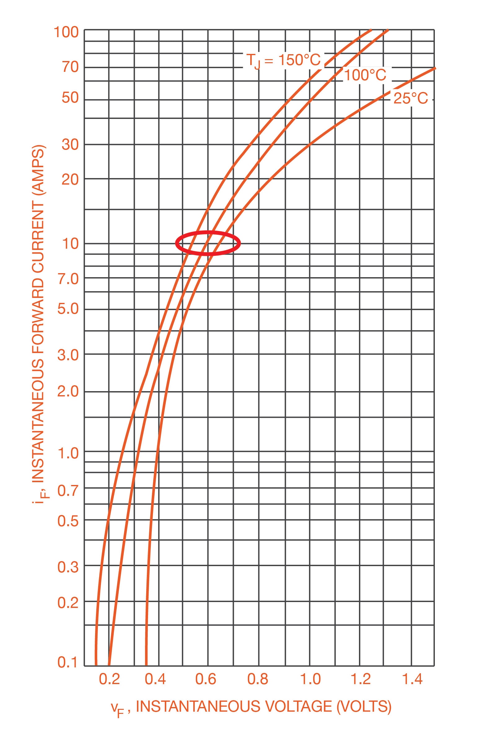
 Characteristic plots show how certain circumstances influence a component’s performance.
Finally, characteristic plots outline how a device performs under certain conditions, such as how a component’s input voltage affects its high-level output voltage.
Understanding Functional, Block, and Connection Diagrams
Block diagrams summarize the individual functional subcomponents of more complex devices like microcontrollers. These schematic depictions also show how certain parts of a circuit connect internally and which subsections influence each other. They are further helpful in understanding how different grounds are connected or which parts of a circuit they reference, what a part’s driving circuitry looks like, how certain sections of a circuit can be bypassed, and how voltages are generated.
Depending on the task, how to read this type of diagram to best utilize the information it contains varies. For example, if the goal is to understand which function blocks affect a particular output pin, you can take a top-down approach and start by finding the output pin in the drawing. Then, you follow the connections through all functional blocks until they arrive at the inputs influencing the output result.
Strategies for Reading Characteristics Plots
This type of drawing might look the most intimidating to newcomers, especially since manufacturers typically put many plots in a grid on the same pages. However, by following a general reading technique, you can make the most of these plots and extract vital information that ensures the device operates within its maximum ratings and at optimum performance.
Start by identifying what values each axis of a diagram denotes. Typically, drawings are presented as two-dimensional plots, thus relating two variables. Plots could depict the time, current, or input voltage plotted against some other physical size, such as temperature or output current. Next, identify the scale and ranges used for the axes. Linear scaling is the most intuitive for most people, and datasheet authors often use equidistant axis lines to highlight that the values follow a linear scale. Time is usually shown using linear axes. Conversely, logarithmic scales are frequently drawn using lines that get closer to each other as the scale goes on. Logarithmic scales are typically used when one axis range varies more dramatically than the others do.
Further, plots can contain one or multiple lines. The number of lines can encode a third variable without adding a third dimension to the plot. Authors often use this approach to show how characteristics vary depending on some third physical size, for example, the component's temperature. The lines can be distinguished by either the stroke style (solid, dashed, dotted, etc.) or color. If all lines look the same, additional labels can help discern them. Some authors also include safe zones in these plots as highlighted areas.
Regardless of the exact visual style, this type of diagram helps obtain an overview of a device's characteristics under certain circumstances and how the characteristics change when one of the plotted sizes changes.
Consider the following example:
 This image shows the input current vs. the supply voltage of a 555 timer.
This diagram uses two linear axes. The x-axis (horizontal) denotes the supply voltage in volts, and, as the scale is linear, each step represents a change of one volt. Similarly, the y-axis (vertical) represents the supply current in milliamperes with a step size of one milliampere. The diagram shows how the 555 timer’s supply current relates to the supply voltage at three different temperatures with no load and when the output is low. The depicted temperatures correspond to the minimum, maximum, and recommended operating temperatures. So, at 25°C and applying a supply voltage of 7V, the input current is around 4.5mA.
Summary
Technical datasheets contain many different types of diagrams. Block, functional, and connection diagrams offer a high-level summary of a part’s internal structure and how a component’s pins are linked to the internal parts. Schematic diagrams illustrate the internal structure in more detail or show the component as part of an example circuit. Truth tables demonstrate how changes in a part’s input values affect the component’s output. Timing diagrams additionally focus on the correct order of signal changes and the delays associated with state changes. Finally, characteristic plots correlate two variables, and they help understand how changes in variable values affect a component. In either case, datasheet plots summarize data that would be difficult to explain using words or tables, and they are often helpful in getting an overview of a part’s behavior.
Have questions or comments? Continue the conversation on TechForum, DigiKey's online community and technical resource.