What is UX, and How Does it Differ from UI?
2023-03-08 | By Maker.io Staff
The terms user interface (UI) and user experience (UX) are often used interchangeably, and many people don’t seem to know the difference between the two. However, depending on the context, the difference might be marginal (or it might be quite significant), and using the terms interchangeably often makes sense when discussing software-related user interfaces. In this article, we’ll discuss the difference between UX and UI and the importance of good UI and UX. We’ll also offer tips for designing an interface that’s pleasant to use.
What’s the Difference Between UI and UX?
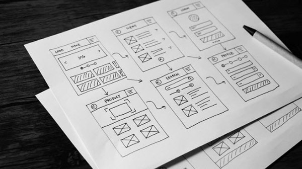
 Good UI and UX must be carefully planned for from the beginning of a design.
When most people talk about a user interface, they most likely refer to a computerized system's graphical user interface (GUI), like their smartphone's home screen.
However, in more general terms, a user interface is the sum of all touch points a user has when interacting with a system of any kind. That can include physical buttons on a washing machine, the keypad layout of an ATM, the on-screen menu of a car's dashboard, and even simple things like a typical household light switch. All of these things are user interfaces that let their users interact with a system, regardless of how simple or sophisticated those systems are.
The user experience, on the other hand, describes how users feel when interacting with a system. It summarizes their experience with a system and how intuitive and valuable they perceive it to be. In that sense, it's understandable why many people use the terms UI and UX interchangeably, as poor UI design can lead to bad UX.
Measuring UI and UX Quality – and the Benefits of Both
 While users may have different tastes, good designers will ensure that every element of their design is purposeful and UI/UX-first.
Unfortunately, it’s not easy to determine what exactly makes an exemplary user interface. While most people can intuitively recognize an intuitive and beautiful UI, quantifying these properties is often not easy, and the task has been the subject of many scientific disciplines ranging from psychology and philosophy to art and computer science. Moreover, as UX is even less tangible, classifying the experience of certain users can only be done vaguely, at best.
Even though it might be difficult, designing a good UI that offers users a great UX is worthwhile, as a good UI can make working with a system seem effortless and easy. A solid UI and UX will make your users excited to interact with your product, whatever it is.
Furthermore, users perceive a system with a properly designed UI that’s easy to understand as more usable, credible, and capable. On average, they typically also make fewer mistakes when working with a system that offers them a pleasing user experience. In e-commerce, shoppers are more likely to spend more money on a website that provides them with a better, more streamlined experience than websites they find confusing.
However, overdoing the design is not a good idea, as there’s a fine line between too simplistic and overly designed, and an overengineered UI can quickly come off as tacky.
Principles for Better UI/UX Designs
When designing a user interface for any application, ensure the interface is consistent between screens or hardware panels. For example, when creating a software UI, all on-screen elements should follow the same design principles, be similarly sized, etc. For physical hardware, make sure that the users can identify common elements by their position: for example, by placing all inputs along the bottom edge while the outputs are aligned at the top of each panel.
Second, keep the intended meaning in mind when working with colors, especially when designing physical machinery – some colors work great in specific contexts. For example, the color blue might indicate PPE regulations in some contexts, while other applications use blue to indicate pipes that carry fresh water. In software UIs, ensure not to wildly mix-and-match colors, and use a limited, consistent palette that fits your project's or organization's identity.
Keep the UI simple and intuitive, and base it on well-established design principles. For example, when designing the turn signal in a car, it is not a wise idea to place the switch somewhere where people might not intuitively expect to find it based on past experiences driving. Similarly, in an iOS app, the back button should almost always be in the top-left corner, because that is what users will expect (which, in turn, is a result of it being a good UI/UX experience).
Don’t Try to Reinvent the Wheel
Any system users can interact with has to offer them a user interface (UI), which is the link between the human and the machine. That interface may or may not provide them with a good user experience (UX), which is highly subjective and heavily depends on the individual, their background, culture, preferences, and context.
However, systems with better UX are generally perceived as more complete, usable, capable, and easy to understand. In addition, users will find working with such an interface effortless and fun, reducing their error rate.
When designing a user interface, stick to well-established guidelines and national codes and legislations, like determining color usage in safety-critical applications. Don’t try to reinvent the wheel, as some people will find completely novel UIs confusing and frustrating.
Have questions or comments? Continue the conversation on TechForum, DigiKey's online community and technical resource.


